Designing Mist
Crux shows a lot of numbers. The design's job is to make one of them obvious and keep the rest quiet. These are the rules it follows.
By Ben Widdowson · · 5 minute read
Try it: swap the accent
The figures at a glance
One accent
The accent is a pale, slightly grey blue, deliberately not the bright blue every phone app inherits. It marks what you can act on and nothing else, so the eye learns where to look. Because it's pale, text on an accent button is dark, not white. White on it was hard to read, and was fixed across the whole app.
Colour follows the moment
Giving each tab its own colour was considered and rejected: the colour would say where you are, which the tab bar already tells you. Instead, colour says what happened. Green means sent or done. Gold means a flash or a personal best, and it's the same gold wherever one appears. Tape colours are the real colours on your gym's wall, because that's what you'll recognise.
Health charts have one fixed colour per metric, so resting heart rate looks the same everywhere it appears. Weight is deliberately left neutral: going up or down is good or bad depending on your goal, and a colour would imply a judgement.
Flat surfaces
A card sits above the page by being a step lighter, or by a thin outline, never by a shadow or a glowing edge. Fewer effects means the numbers carry the screen. There are two exceptions, both for a reason:
- A dark fade over photos and maps, so white text on top stays readable.
- A shadow under things that float, such as a pop-up menu or the raised log button, to show they're above the page rather than part of it.
One figure per screen
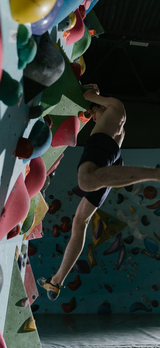
Each screen opens on one large number or title, with a short line beneath it. Everything else sits on plain cards below. On a climbing session it's what you sent. On a strength session it's the weight lifted. On your profile it's your name.
 Thursday · your gym
Type
- Sora for figures and titles. Its figures are clear at large sizes, which suits screens built around one number.
- Instrument Sans for everything you read.
- Sentence case everywhere. All-capital labels read as loud, and they're harder to scan. There are none in the app.
The mark
Three equal chevrons, stacked, in the accent at full, 60% and 30% strength. It reads as moving upward and fading below, like a route. The name is set in Plus Jakarta Sans, under the line "Know your climbing."
What we do not claim
- That it's finished. Older screens are brought into line as they're changed, so you may still find odd sizes.
- That it was tested with a large group. The direction was chosen from three rounds of designs and has been used by beta testers, not measured in a study.
Common questions
Is there a light mode?
Yes. It follows your phone's setting. Dark is the design, and light is worked out from it for bright places like a crag or a car park.
Why do some charts use other colours?
Each metric that appears on several screens has its own fixed colour, so heart rate always looks like heart rate. Weight has none on purpose: it has no right direction, and a colour would suggest one.
Found an error? Email hello@cruxlog.app. This note is general information, not medical or coaching advice for your situation.
See your own climbing this way
Crux is in beta on iPhone and Apple Watch.